
Stir Crazy Kids - Lunch Order APp
Stir Crazy Kids was a real client-led project, a mobile app designed to help parents order their children’s school lunches straight from their phone.
❋ PROJECTUX / UI / Visual / Branding / Mobile App
❋ MY ROLEUX/UI Designer
❋ TOOLSFigma, Miro, Illustrator, Photoshop
❋ TIMELINE6 - 8 weeks
Many schools still rely on handwritten lunch orders on paper bags, which can be messy, easy to lose and time-consuming for both parents and canteen staff. Parents want a quick and stress-free way to place orders, and schools need a system that reduces mistakes and confusion.
The Problem
To create an interface that felt fun and engaging without becoming overwhelming or chaotic, ensuring usability remained the priority.
The Goal
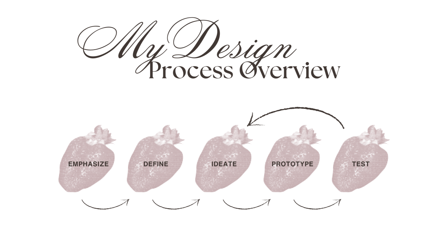
Research & Strategy
Through stakeholder interviews and competitive analysis, key insights emerged:
• Parents need fast access to essential information (location, pricing, age groups, availability)
• Trust signals (clear messaging, testimonials, structured layout) are crucial
• Overly busy design reduces clarity and increases cognitive load
From this, I developed a streamlined site architecture that prioritised hierarchy, clarity, and conversion-focused pathways.
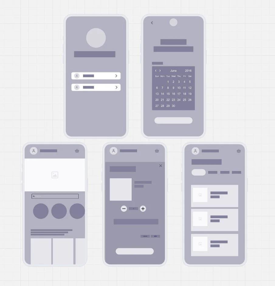
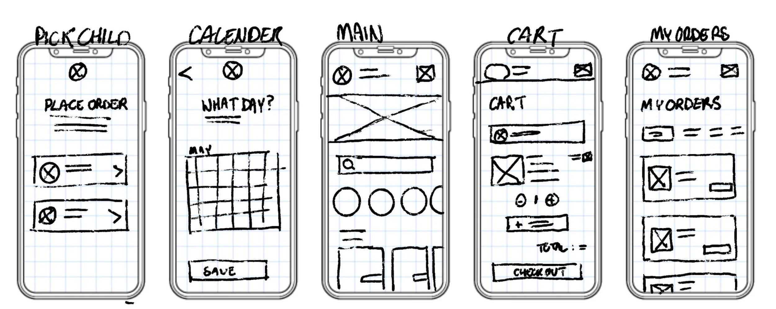
Wireframing & Prototyping
I began by creating low-fidelity wireframes to restructure the site architecture and prioritise key user actions, particularly bookings and service exploration. The focus at this stage was clarity, ensuring parents could quickly scan information and navigate without friction.
After validating the layout direction with the client, I developed mid- to high-fidelity interactive prototypes to test hierarchy, call-to-action placement, and overall flow. This allowed us to refine page structure, simplify content sections, and improve conversion pathways before final visual styling.
Prototyping also helped align stakeholder expectations, making it easier to communicate functionality and iterate efficiently prior to development.
Design Approach
The visual direction focused on:
A vibrant yet controlled colour palette
Clear typographic hierarchy for scannability
Structured layouts with generous spacing
Strong call-to-action placement for bookings
Responsive design to ensure seamless mobile usability
The final interface balanced playful brand expression with usability and trust.
Results
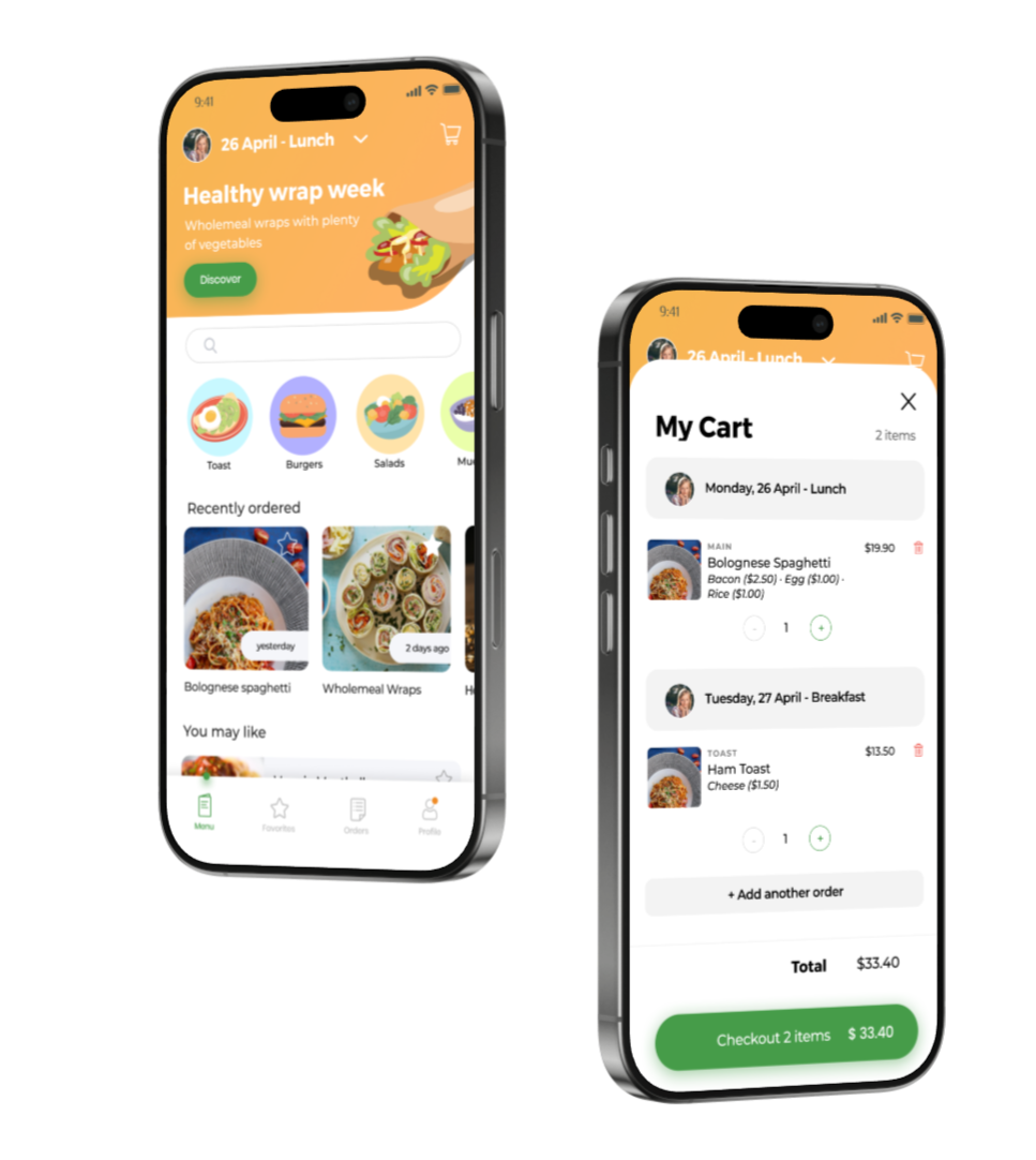
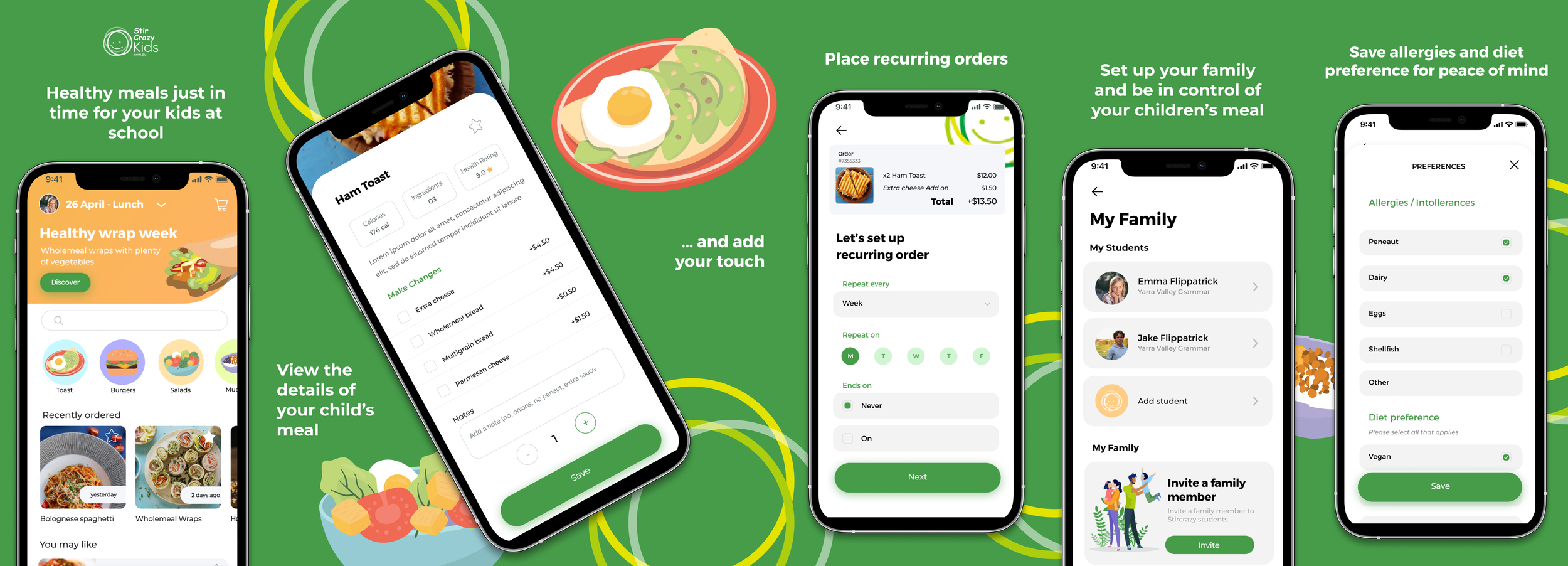
Designed and delivered a dedicated parent-facing app for ordering children’s lunches
Streamlined the ordering process, reducing friction and manual coordination
Improved clarity and convenience for busy parents through a mobile-first experience
Created a scalable digital foundation to support future features and growth
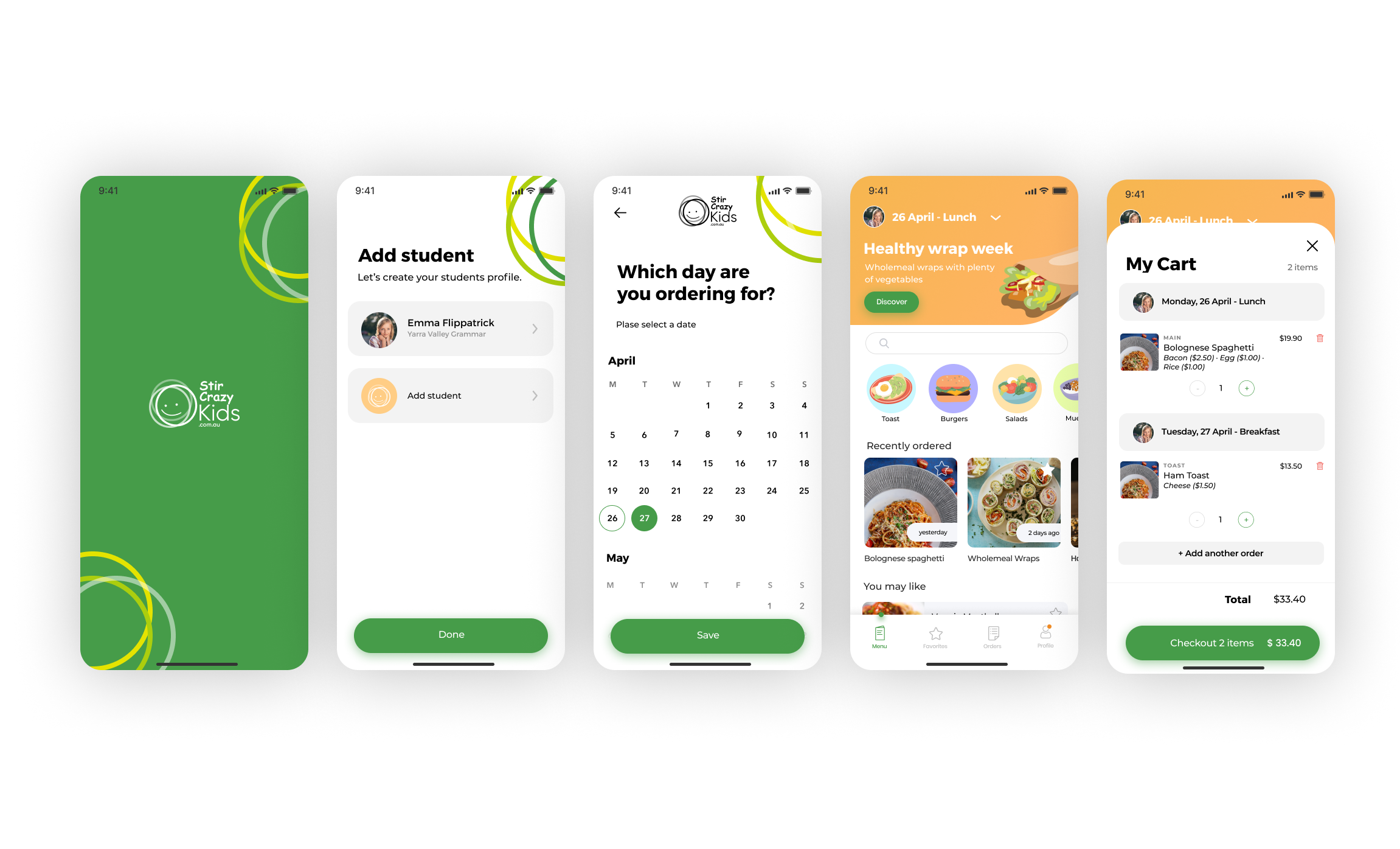
The final app allows parents to select their child, choose from the school menu, place orders in advance and pay securely. Orders are sent directly to the school canteen, reducing mistakes and saving time for staff.
Want to work together?
If you like what you see and want to work together, get in touch!