

MEND – Digital Medical Forms App
MEND was a client-led medical app designed to replace paper-based forms with a simple, digital system.
❋ PROJECTClient Project , UX/UI , Mobile App + Web Admin Dashboard
❋ MY ROLEUX/UI Designer
❋ TOOLSFigma, Miro, Illustrator, Photoshop
❋ TIMELINE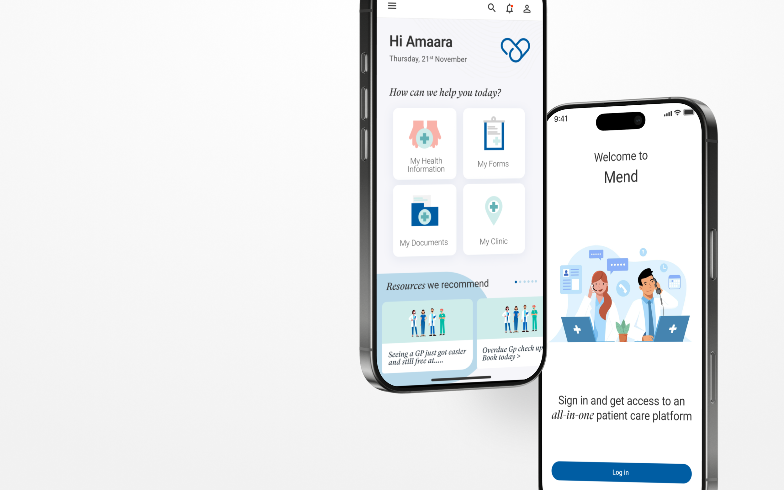
6 - 8 weeks
The Problem
Medical clinics often rely on paper-based systems for intake, consent, and patient records. This creates inefficiencies such as misplaced forms, long wait times, and administrative strain. Patients also struggle to access their own information when needed, leading to frustration and reduced trust.
MEND was created to digitise and streamline this process, making documentation organised, accessible, and intuitive for both clinic staff and patients.
The Goal
Design an all-in-one app where clinics can manage forms digitally, and clients can view, complete and store all their information in one secure place, removing the need for paper entirely.
⚡️The Challenge: The client wanted an intuitive user journey and a calm, modern interface that felt supportive rather than transactional, while remaining scalable for future growth. The challenge was balancing sensitive subject matter with clear, structured UX to avoid overwhelming users.
My Role
As the Product UX/UI Designer, I led:
UX research & user journey mapping
Information architecture & flow creation
Wireframing & low–mid fidelity prototyping
UI design & visual system development
Component system & design consistency
Interactive prototyping for validation
I worked closely with the client to align on brand tone, functionality, and long-term product vision.
Research & Strategy
Through stakeholder discussions and competitive analysis, we identified three core user needs:
Clarity — Users needed simple navigation and clear pathways.
Emotional safety — The design had to feel soft, supportive, and non-intimidating.
Structure — Content needed hierarchy to avoid overwhelm.
From this, I developed a structured yet minimal interface that prioritised whitespace, gentle typography, and intuitive navigation.
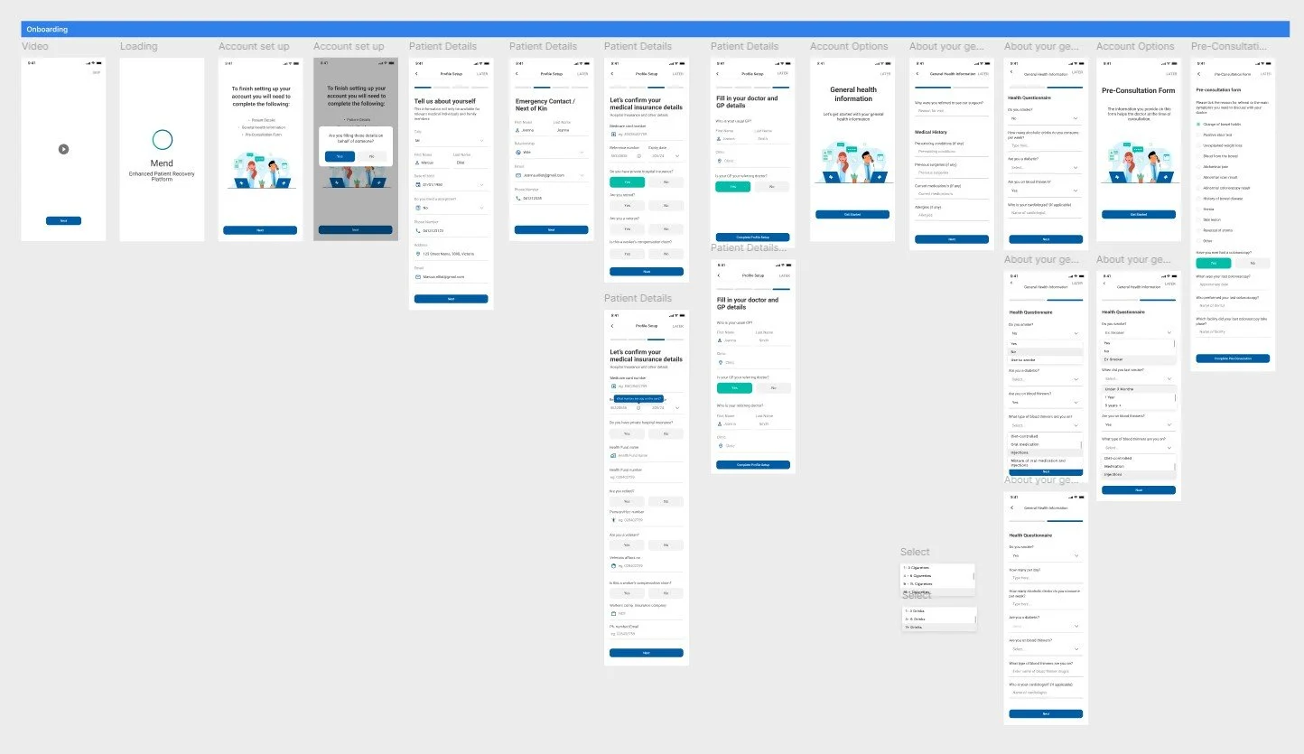
Wireframing & Prototyping
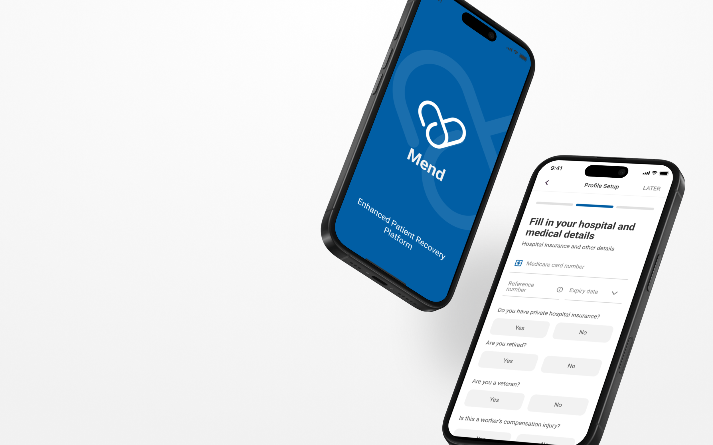
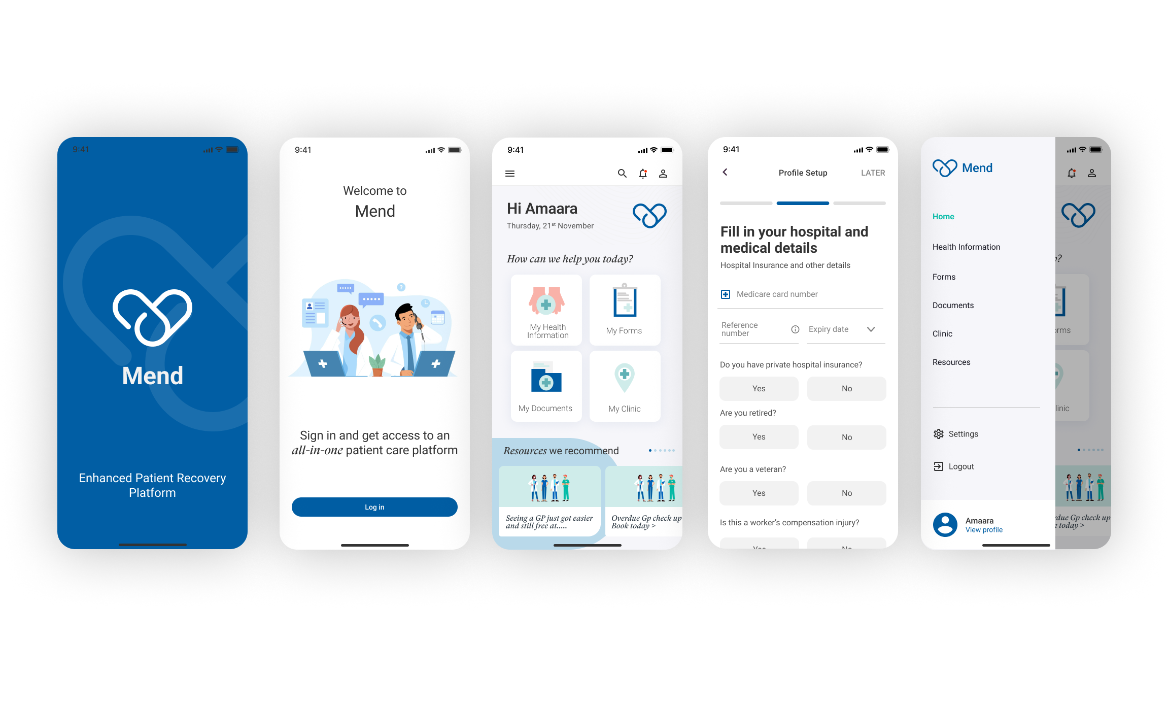
I began by mapping user flows for two main users: reception staff and clients. I then created wireframes to design how forms would be uploaded, completed and stored. Through multiple design iterations, I refined the layout to make information easy to scan and actions easy to complete.
Design Approach
The visual direction focused on:
Muted, calming colour palette
Clean typography with clear hierarchy
Generous spacing to reduce cognitive load
Subtle interaction cues for guidance
Soft visual elements to reinforce emotional warmth
Rather than heavy UI decoration, the design relies on clarity and restraint to build trust.
RESULTS
• Delivered a fully designed and interactive prototype
• Established a scalable design system
• Clarified the client’s product positioning through UX structure
• Strengthened brand trust through cohesive visual language
The final solution positioned MEND as both emotionally intelligent and professionally credible, aligning with the client’s long-term vision.
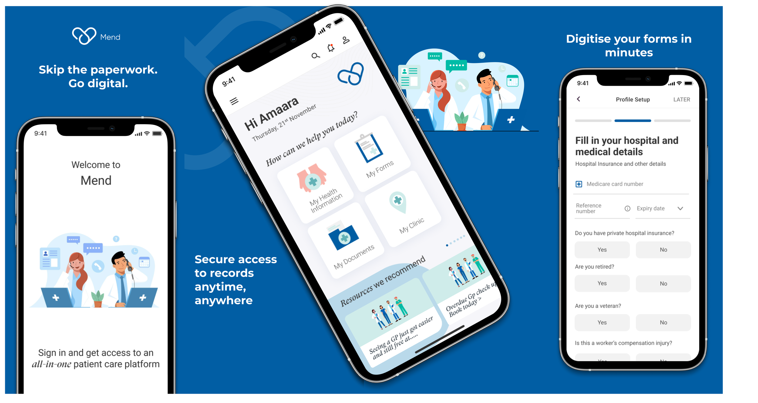
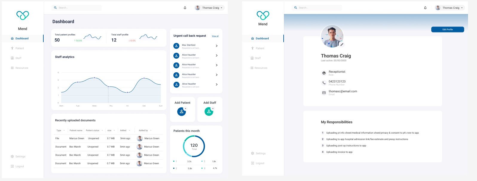
MEND features a clean dashboard where staff can upload and manage forms, and clients can view, fill out and save all documents digitally. Key features include secure logins, form templates, auto-save, and a personal profile area where clients can access everything in one spot.
Want to work together?
If you like what you see and want to work together, get in touch!