

Curate
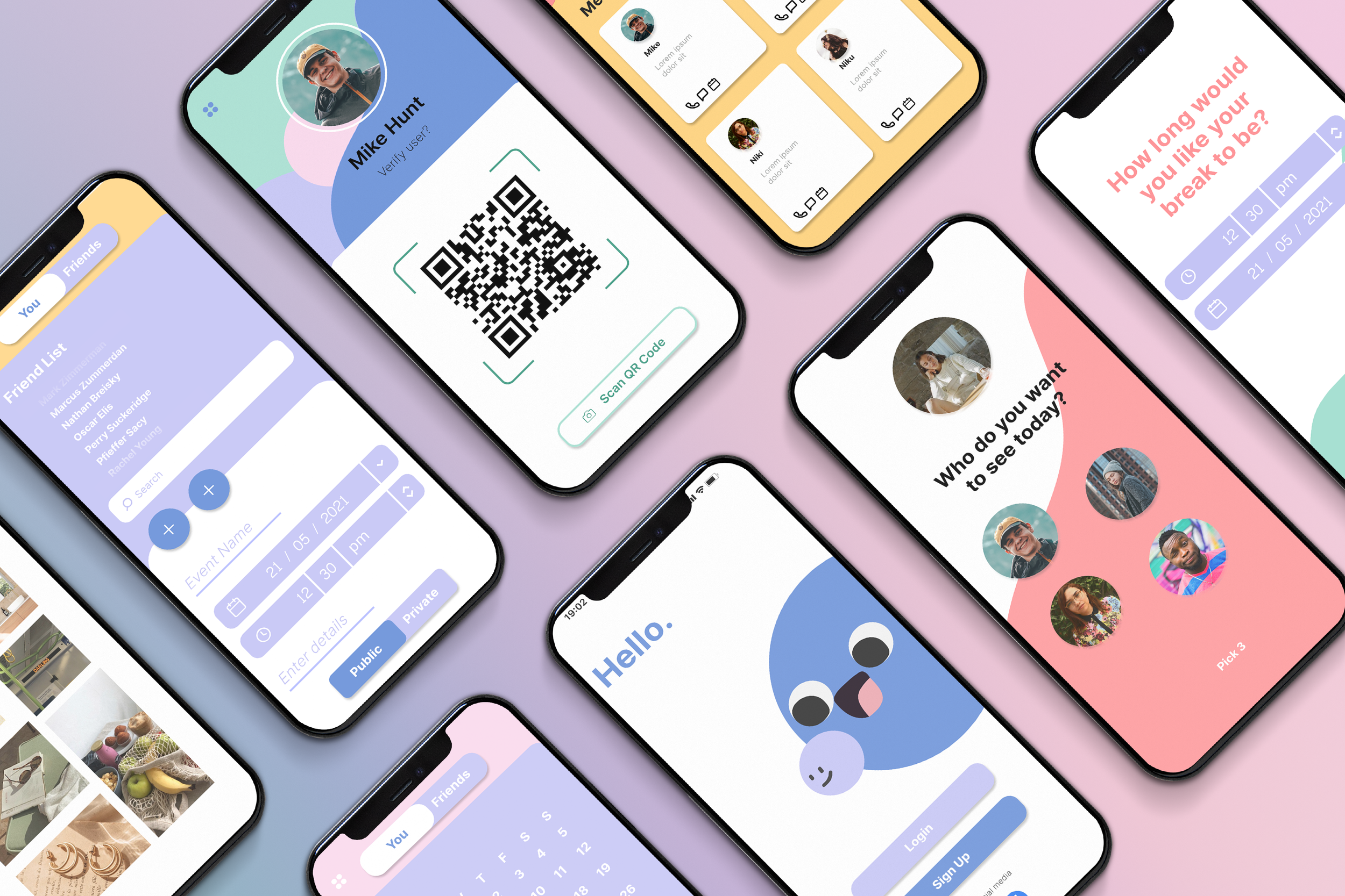
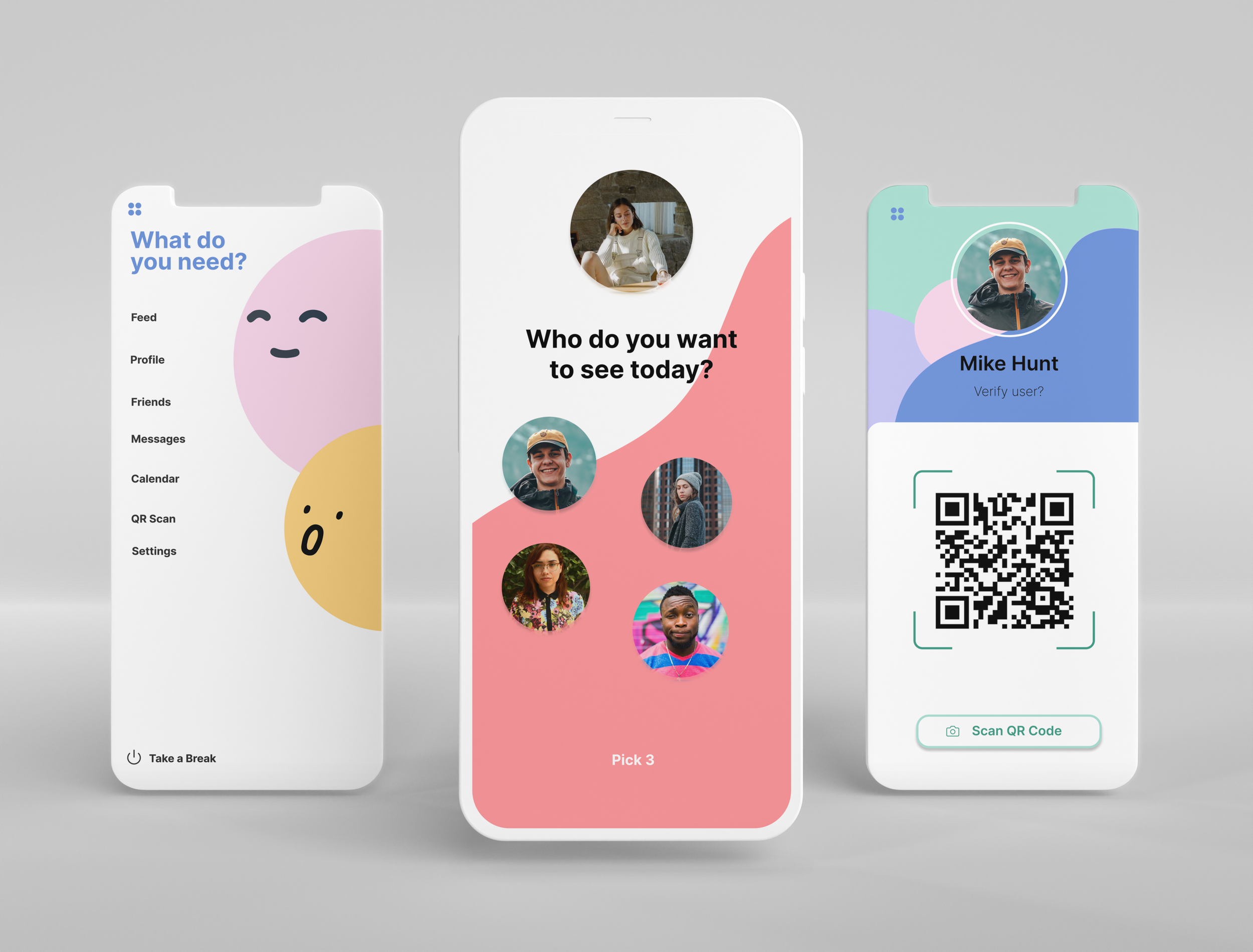
Curate is a social media platform focusing on promoting face-to-face interactions and providing limitations to prevent excessive social media usage.
❋ Project TypeUX / UI / Visual / Branding / App
❋ My RoleUX/UI Designer
❋ ToolsFigma, Miro, Illustrator, Photoshop
❋ Timeline4 months
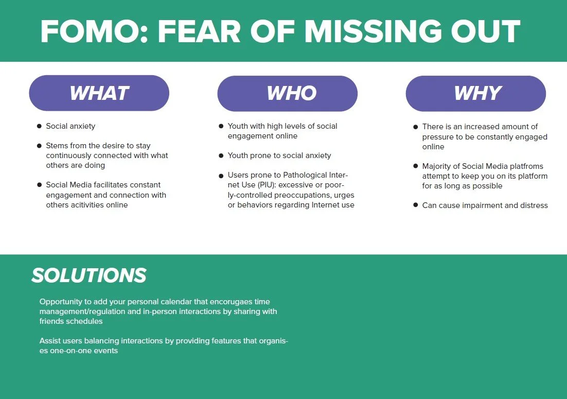
Social media has taken over people's lives by having us connected 24/7 to our phones.
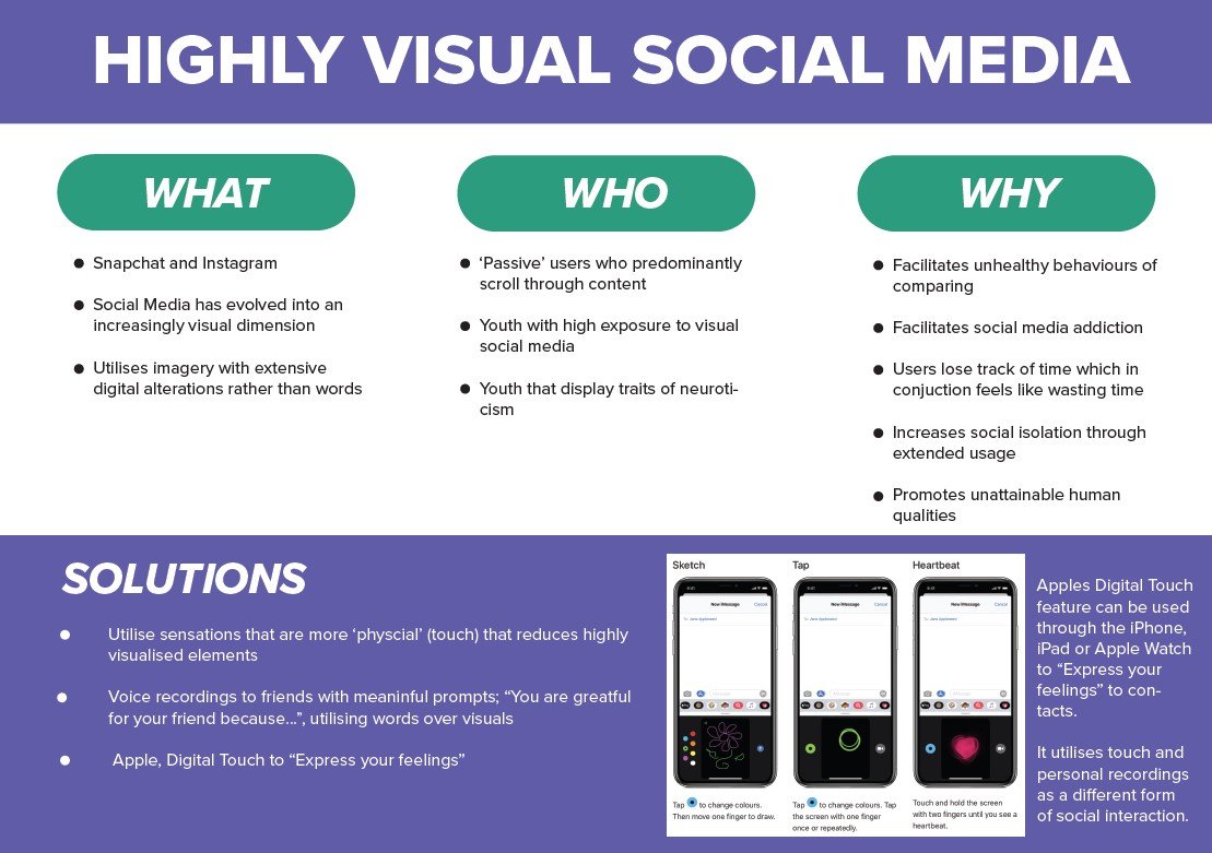
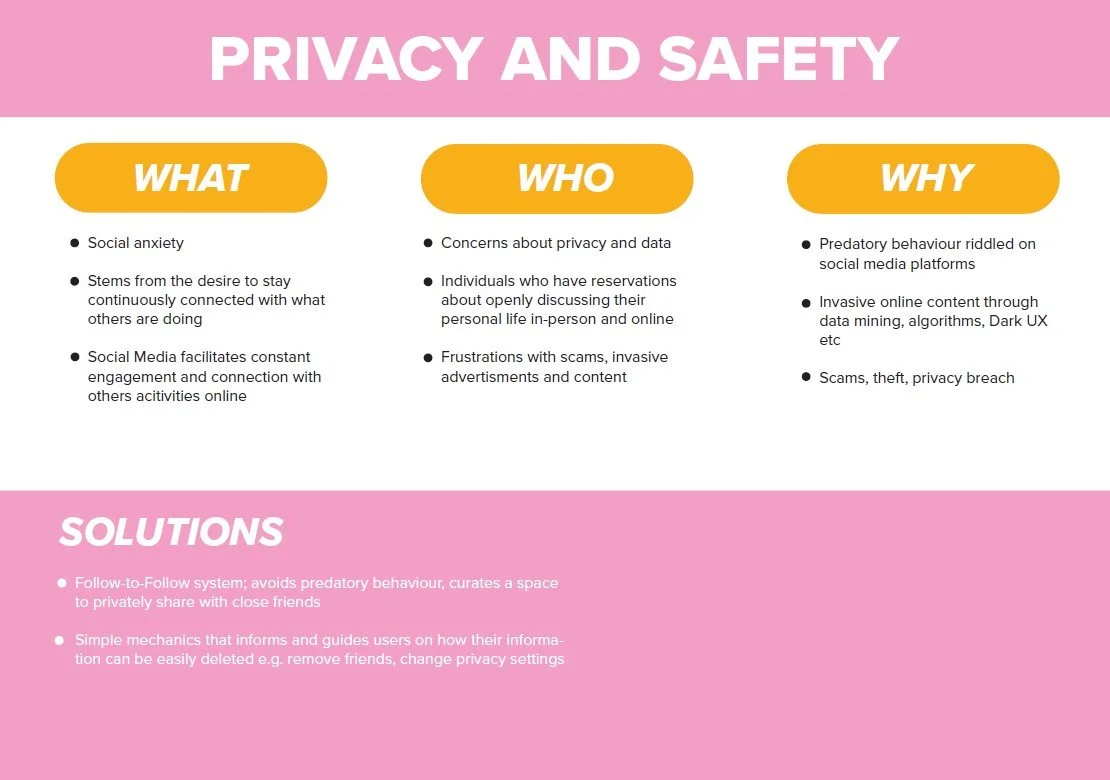
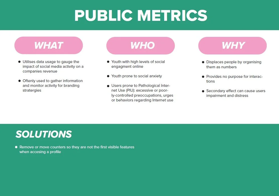
The problem is a disproportionate use of social media that also takes away from face-to-face interaction. The issue is the lack of consequence in social media interactions, not being able to mute, unsend, restrict, and 24hr stories. So we ask ourselves the following question ... We need to use social media in a healthy and impactful way to bring well-being as well as real-world issues to users, we can promote a "Playful Balance". We want a playful balance between social and worldly/face-to-face interactions. Also having the ability to express ourselves through video, images and posts without projecting and inadvertently promoting negative body image, We want to be able to promote authenticity so we can be ourselves on social media. The capacity to control what is real and social, and still receive a beneficial experience once leaving the app.
The Problem
Curate, a social media platform focusing on promoting face-to-face interactions and providing limitations to prevent excessive social media usage.
The Goal
"How might we balance the use of playful interaction on social media while creating a positive impact on mental health?"
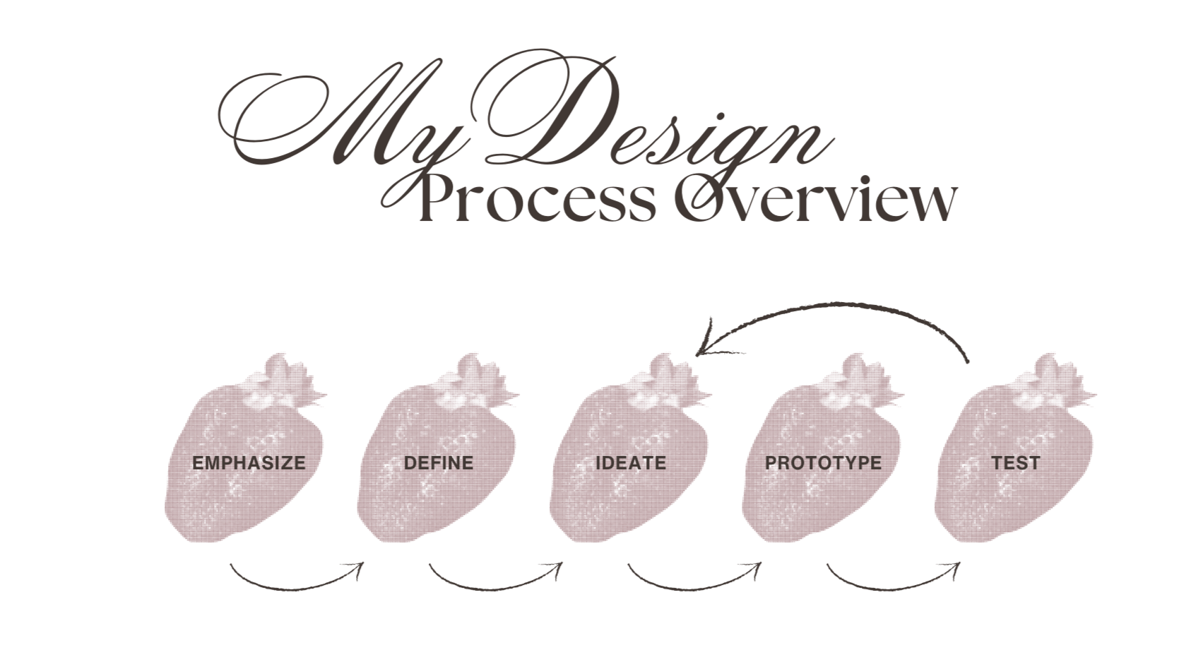
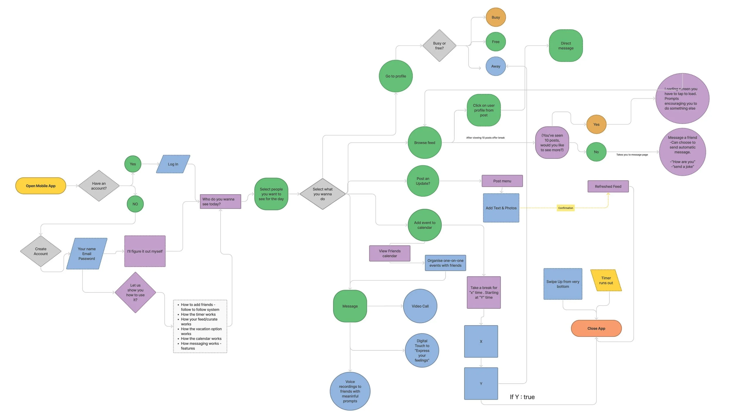
[Explain your steps: sketches, wireframes, flows, iterations, challenges.]
Research
User Interviews + Surveys + Competitive Analysis
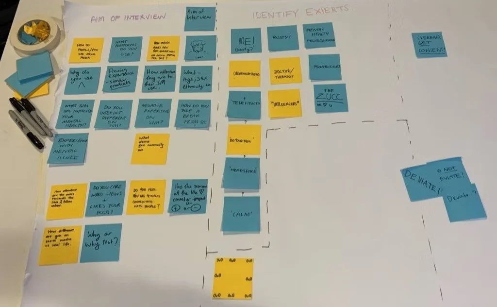
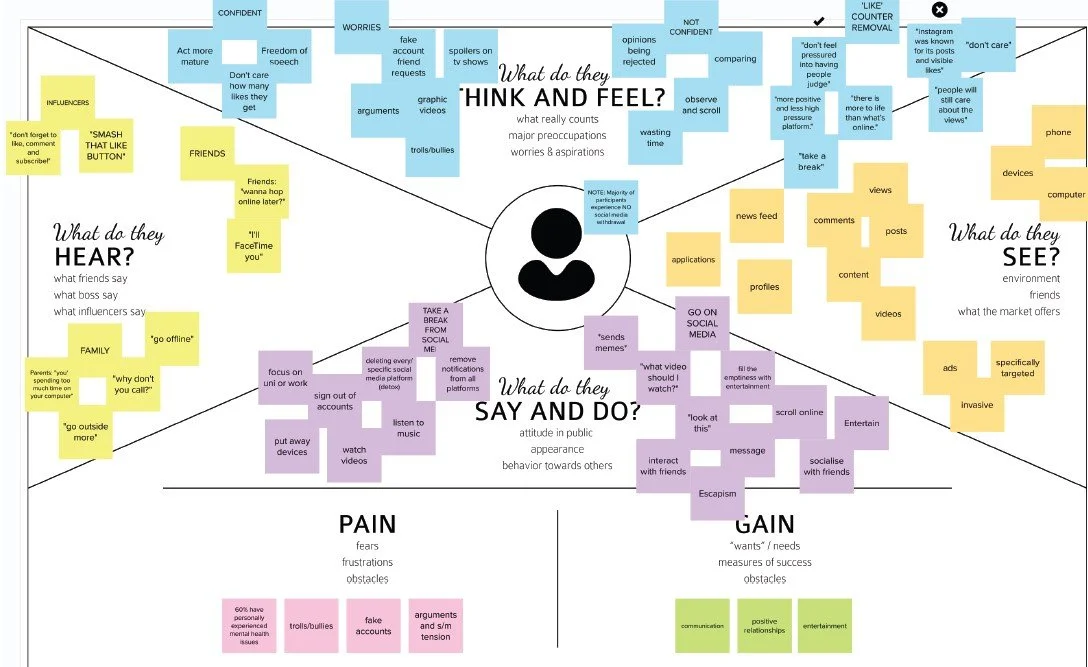
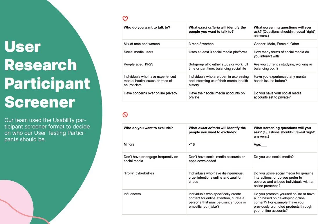
In class, we collaborated on ideating for our research phase. We identified several aims for the interviewing process and identified experts on mental-health focused social media applications. Our research activity included interviews, surveys, an empathy map and key insight. Each member of the group took on 2 interviews each, with young adults aged between 18-23 yrs of age. Along with these interviews we also conducted surveys. Of the 5 surveys, I received all 5 surveys back completed, which gave us our first insight into personas. During this task, we were all gathering information to begin our mapping and themes began to emerge, which would give a better insight into our research. This task fulfilled the objective of collecting the first lot of information to form an idea.
Interviews goals
The questions in the survey covered the following topics:
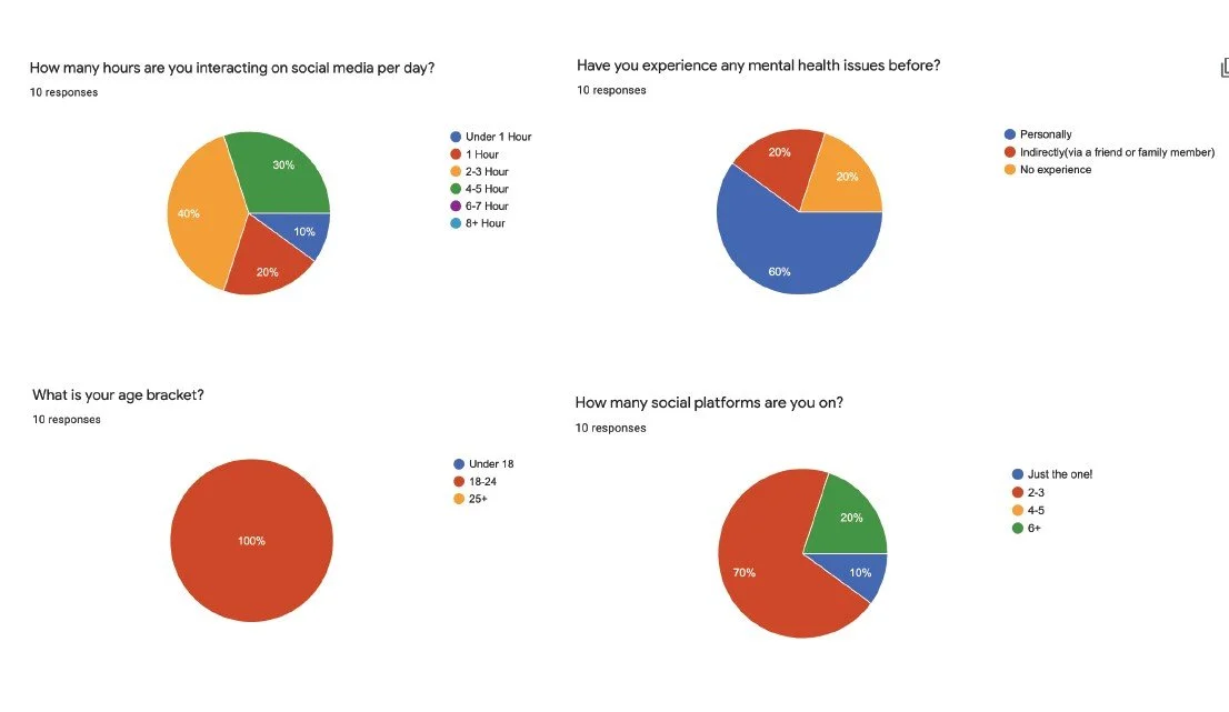
How many hours are you interacting on social media per day?
How have you experienced any mental health issues before?
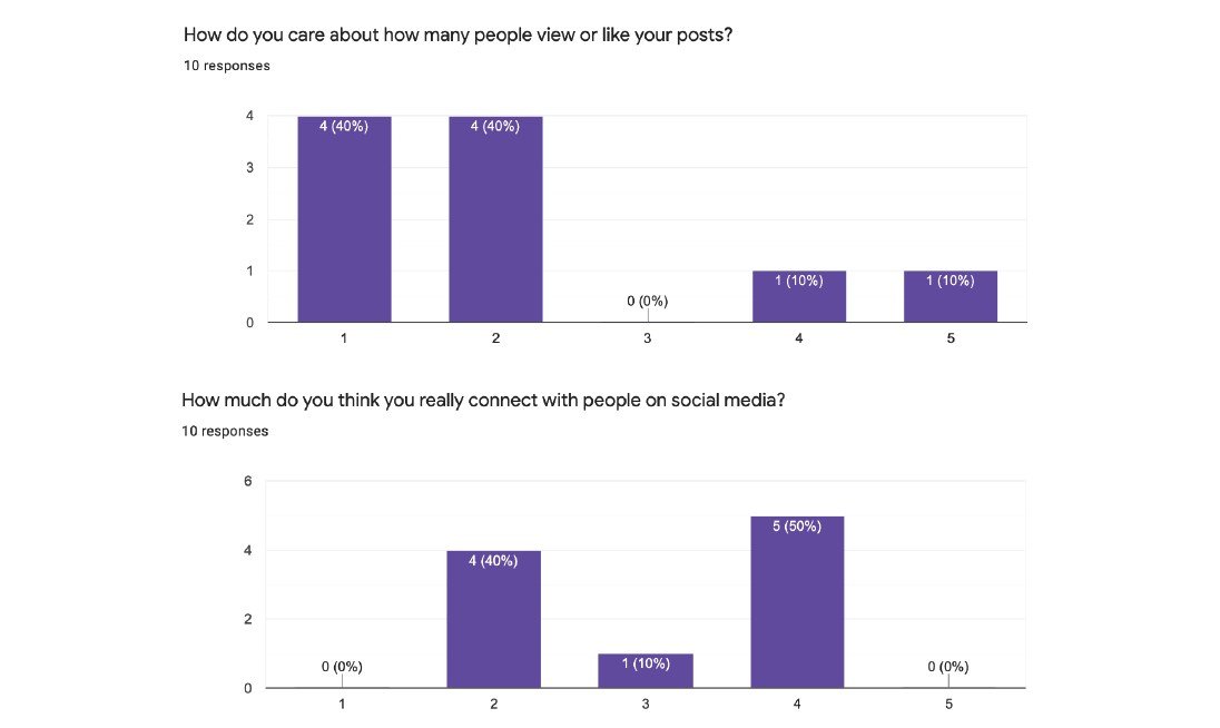
How much do you think you are really connected with people on social media?
Key findings from interviews and surveys
"I feel face-to-face interactions are more meaningful and helpful but I also consider social media platforms is a good way of balancing our social lives because our schedules may not always align."
Daniel 21
"I like what content social media brings and how it connects communities together, but I feel like the drawbacks of social media can be potentially dangerous for people’s mental and physical health."
Lauren 20
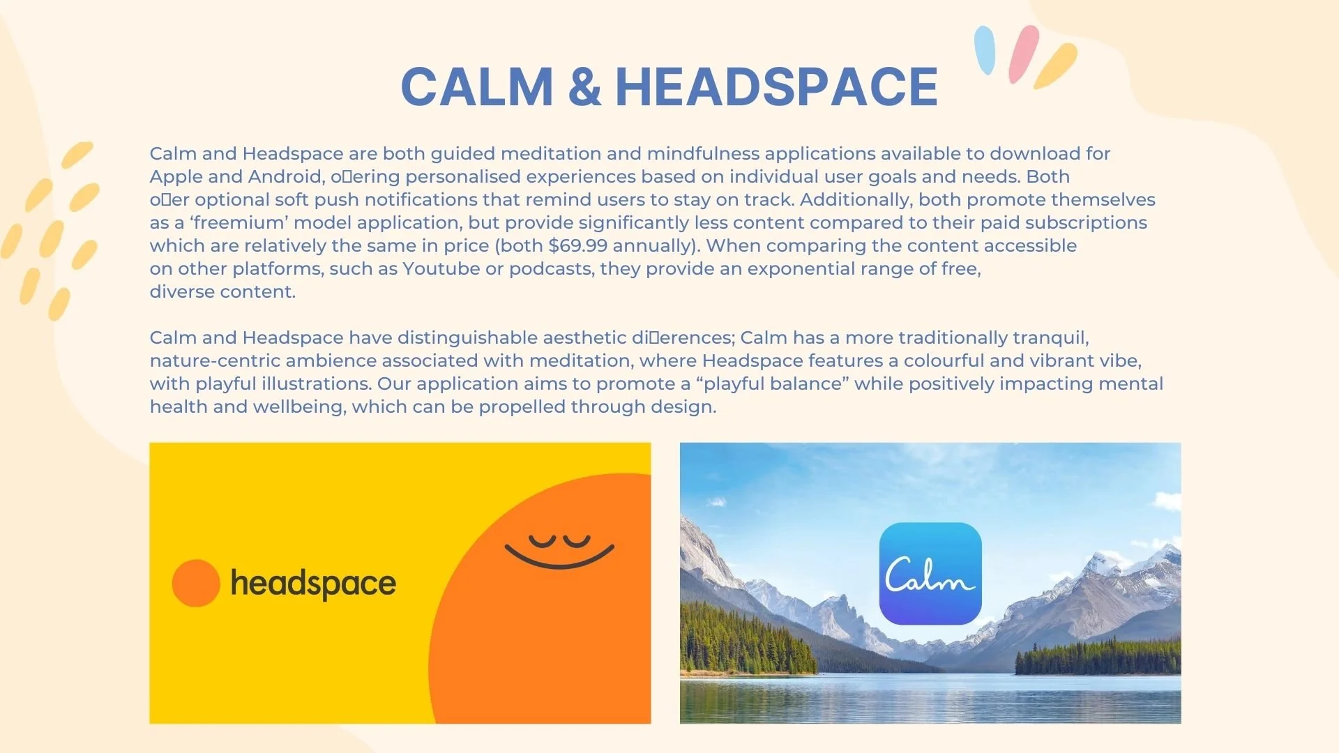
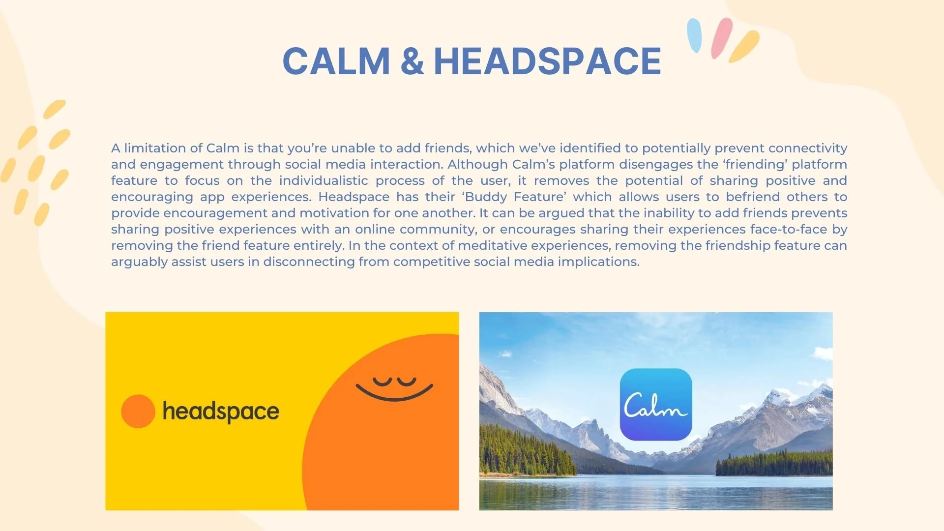
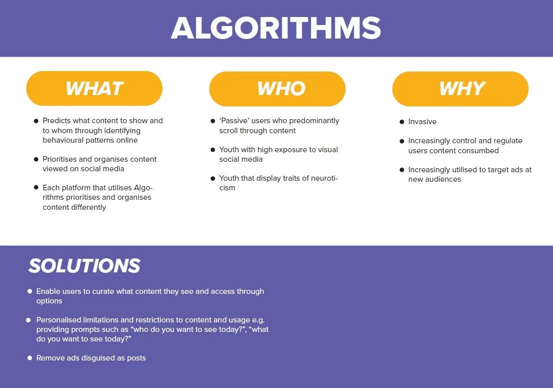
Competitor analysis
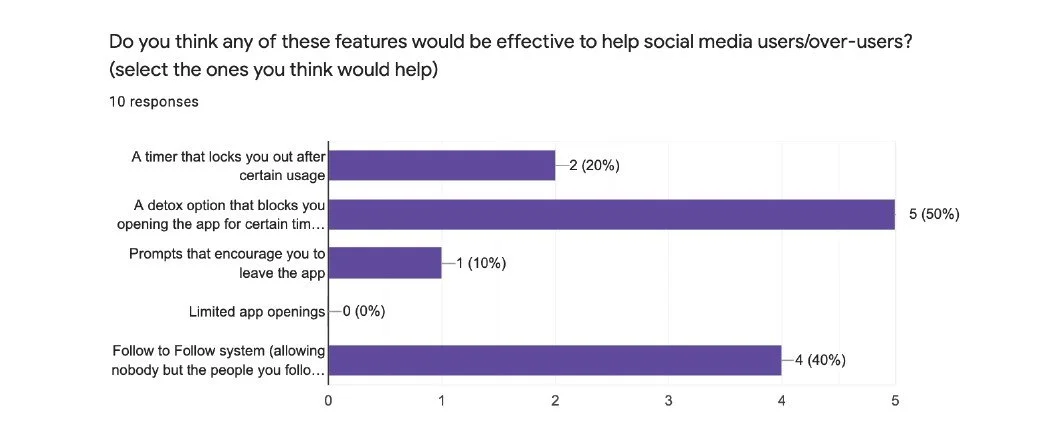
Conceptual Restricitions
Separating media coverage and stories from feed.
Encouraging prompts and alerts.
Regulates how much time you’ve been spending on social media and oers assistance: could be invasive and annoying rather than helpful.
People may become frustrated with our platform and invest their time in competitors, undoing whatever beneficial options we provide.
People may go and use other apps and the app could become not as eective in constraining the usage of social media.
Technical Restrictions
This app could not restrict people from using other applications on those other apps.
Cannot account for users engaging with multiple devices and platforms at once.
Limited to a screen and audio as output, microphone and camera as input.
This app only could encourage the users to leave the phone to do other things but not ban them from using the phone.
The app only helps to promote a healthy living habit for the user but is not allowed to force them to change their habits.
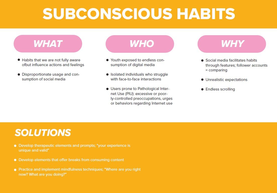
Working our way through the mapping exercise led to our personas which in turn gave us our theme and insights. Together as a team we were able to work out the recurring themes from the interviews and surveys. This is a highly important process in the design process for this project to work effectively and flow onto the next phase. Once themes and insights are identified we made sure to explore them thoroughly, to have a clear understanding of the impact these issues have on the user experience.
Analysis
Breaking down and visualising
We have come up with different ways to map our research, and we identified the need to look into how social media makes you feel. As part of the process of coming up with the right canvas, that canvas will give you the best option to any problem/solution from a very specific to a broader issue. Part of that process would be to facilitate discussion among my team. Which was done weekly. Then create a clear representation of the persona that was appropriate for the project being developed. Whatever the need may be, no matter the size of the project, we should always include brainstorming workshops and whiteboarding with my team so we don't miss out on opportunities. Make sure that the tool is appropriate and our skills keep developing over time.
Key Development
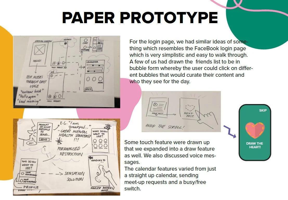
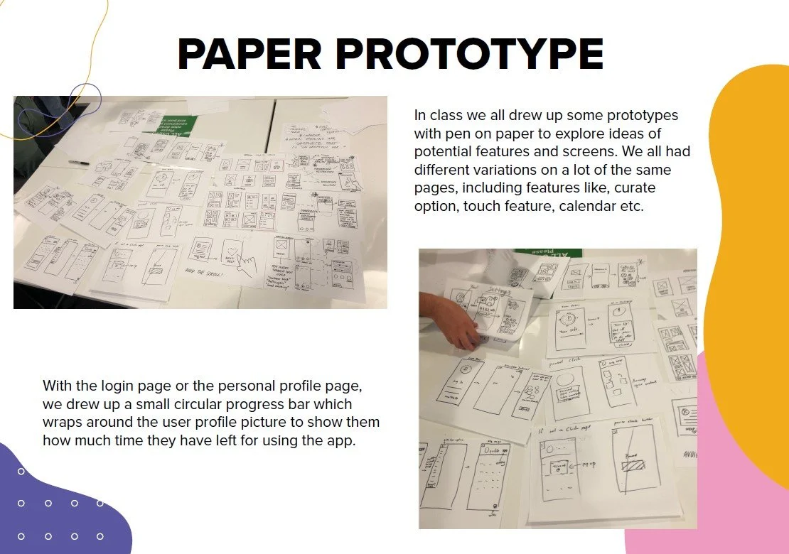
Paper Prototyping
Upon reaching this part of the project we all went away and explored our own paper prototyping and user flow for our app. This not only gave us an opportunity to look at 3 other perspectives and also provided an important feedback tool, to better understand what works better for the design of this app. In the end what we discovered when we came together was that we actually all had similar features, start-up pages and concepts. From this point we expanded on the idea and used the best feature of each team member combining all concepts into one, this was done collaboratively while discussing the pros and cons of what would and would not work.
Testing + Improvements
Usability testing with high-fidelity prototype.
Our group has created a series of goals to meet when responding to User Test results and our final prototype. Our group believes that if we can justify and develop our features within Curate that meet these goals, we have realised a creative and original concept.
Design
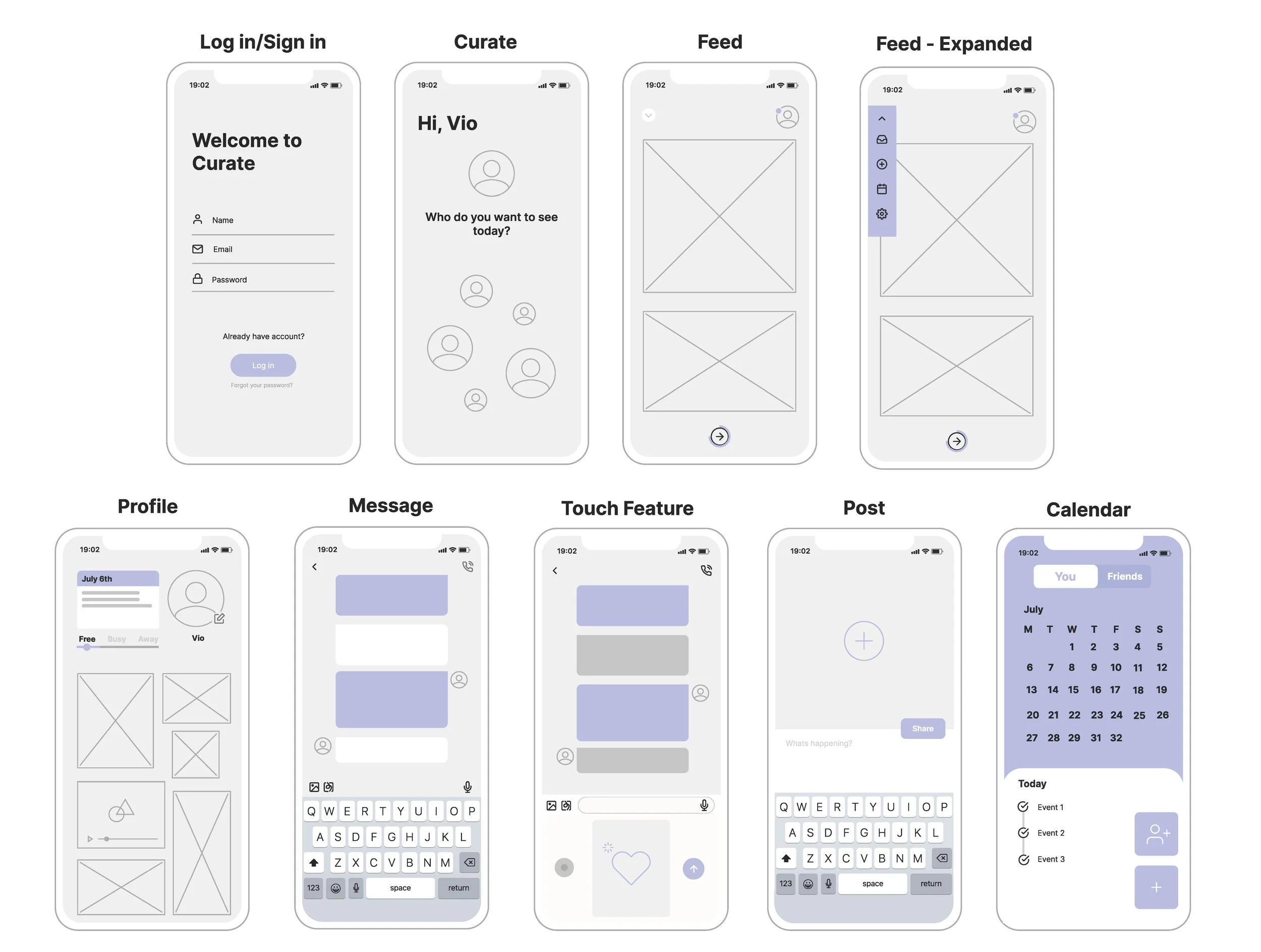
Lo-Fi Prototype
After working out user flows, we then mocked up a few screens on Figma to prepare it for initial testing and user feedback.
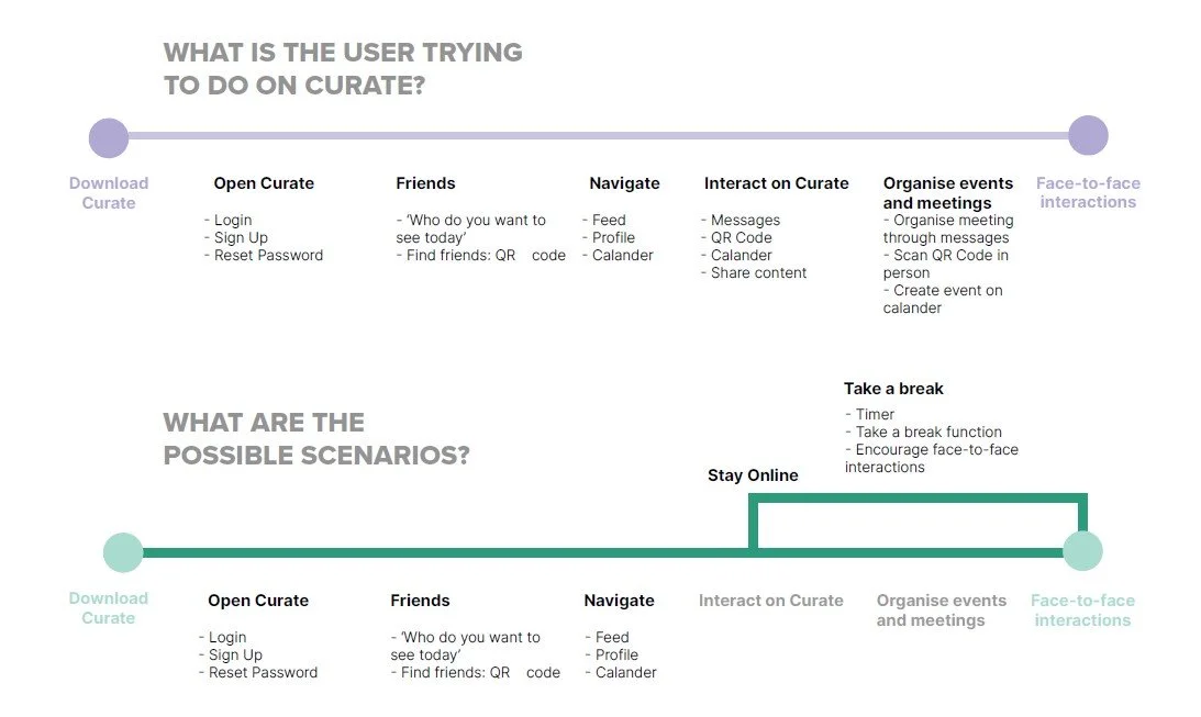
Designing user flows
This stage of the project was the most important part, as it gives us the journey that the user will take when using our new feature. This allows for the designer the opportunity to evaluate and enhance the user experience and make adjustments.
User Testing Goals
Onboarding Experience
Completion
Users complete and respond to User Test features and feedback.

Usability
We identified features users preferred and engaged with positively.

Interaction
Users can see the potential of Curate promoting face-to-face interactions.

Refine
We identified areas that require either improvement or alterations.

Audience
Our app appeals to and engages with our primary audience.

Engagement
Users would use, engage and promote Curate with friends.
Our user-testers experienced confusion when navigating our
onboarding experience, where we observed tapping on icons and
images that didn't have interactions. Our solutions are to introduce incentives that provide feedback.
For example, add circular prompts next to information that shows optional feedback when pressed. Additionally, we will be providing a tutorial that prefaces users' interactions before navigating the application.
Micro Interactions
Our initial prototypes were lacking micro-interactions that overlooked conspicuous usability. An example was on the login page of an onboarding experience, the users' initial reaction is to press the email input button. We have integrated pages that once a user presses these information inputs, the next page will show them filled out.
A way to combat future issues regarding this is to ensure our team empathises with users' experiences and closely observes how we interact with other applications.
Profile Features
Notable feedback we received from user-testers was that profile features of Curate had the potential to be further fleshed out. From observing their inter-actions, we witnessed curiosity in other profiles and our calendar feature. Our response is to employ a scroll-down feature that reloads profiles but restricts navigations to four different.
Regarding our calendar feature, we intend to provide more depth and flesh out its interactions. We hope these changes allow users to easily navigate these features and extend their curiosities to our entire application.
Testing + Improvements
Outcome & Reflection
What I have learned from this project and the user experience is that is all done through research, we conduct this in methods through surveys and interviews. The whole process is about improving the experience of the user, this is the starting point for all projects. Conducting tests and validating ideas is one of the best ways to measure the success of test results, this gives us the information we would not necessarily have if not by this method. It also allowed me to build my skills and confidence in these areas over the number of weeks we were involved in the project. The core step I learned in UX process and methods is that research is the centre to gain a clear and effective picture of what users think and why they do what they do. I can conclude, upon reflecting on what I have learnt whilst undertaking the group project, that a great deal has been learnt, experienced and confronted in all aspects of this project.
Looking into all areas of the project the parts I would do differently is polishing up the details of our prototype, testing and adjusting more to ensure we have a long-standing product. Tidying up the functions to ensure they are all working accordingly having an overall professional look and feel. For my team, I would make the workload reasonable and the goals clear, also consistent meetings with individual members to keep track of their contributions. I would make sure we are constantly communicating effectively, working as a team staying organised and checking in with one another.
Want to work together?
If you like what you see and want to work together, get in touch!